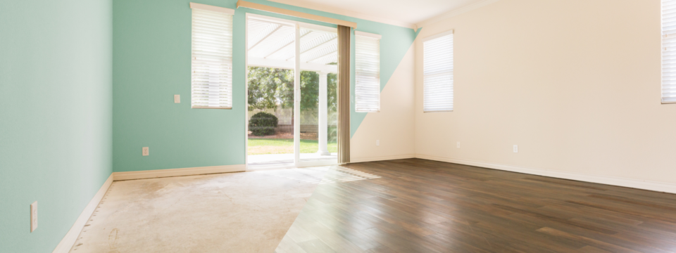
Choosing the right paint color for your home is more than just an aesthetic decision—it can transform a space, evoke emotion, and even impact how we feel on a day-to-day basis. With so many options to choose from, the process can be overwhelming. That’s why we found this painting company, Paintology Paintworks, to help us pick a good color for our kitchen. Their expertise helped us make a decision that balanced style, functionality, and mood. In this guide, we’ll explore expert strategies for picking the perfect paint color for your space, whether it’s a cozy bedroom, vibrant kitchen, or calming living room.
Understanding Color Psychology
Before diving into color palettes, it’s essential to understand the concept of color psychology. Colors can evoke specific emotions and affect the way we perceive a room’s size and mood. For instance, blues and greens are known for their calming and serene effects, making them ideal for bedrooms or relaxation spaces. On the other hand, reds and yellows are more energetic and stimulating, perfect for kitchens or dining areas where lively conversation often takes place.
Warm vs. Cool Colors
Warm colors, such as reds, oranges, and yellows, tend to create a cozy, inviting atmosphere. These hues are perfect for gathering spaces like living rooms and dining areas, where you want to foster a sense of warmth and connection.
Cool colors, like blues, greens, and purples, evoke tranquility and calm, making them great choices for bedrooms, bathrooms, and offices where relaxation or concentration is needed. When selecting paint colors, it’s important to consider the purpose of the room and the emotions you want to elicit from the space.
Considering the Room’s Lighting
Lighting plays a significant role in how a color will look on your walls. The same shade can appear drastically different under various lighting conditions. Natural light, artificial light, and even the direction of the room can alter a color’s appearance.
Natural Light
Rooms with ample natural light can handle bolder or darker colors since the sunlight helps balance out intensity. South-facing rooms, for example, receive strong light throughout the day, which can enhance warm tones. In contrast, north-facing rooms receive softer, cooler light, making warm tones appear slightly muted and cooler shades feel more prominent.
Artificial Lighting
The type of artificial lighting in a room also impacts color perception. Incandescent bulbs give off warm, yellow light that enhances reds, oranges, and yellows. Fluorescent lighting, on the other hand, casts a cooler, blue-toned light that can make colors appear harsher. LED lighting can vary between warm and cool, so consider the bulb temperature when choosing your paint color.
Testing Colors with Swatches
One of the best ways to see how a color will look in your space is by testing swatches on your walls. Paintology Paintworks recommends painting large samples on various walls of the room. Observe how the color changes throughout the day as the light shifts. This allows you to visualize the final outcome more accurately.
Coordinating with Existing Décor
Your paint color should complement the furniture, flooring, and décor in the room. Consider the style of your furniture and the overall theme of the space. Are you going for a modern, minimalist look with sleek lines and neutral tones, or do you prefer a cozy, rustic vibe with earthy shades?
Matching Undertones
One of the most common mistakes in selecting paint colors is ignoring undertones. Undertones are the subtle color nuances within a paint color, such as a blue undertone in a gray paint or a pink undertone in a beige color. These undertones can either harmonize or clash with the rest of your room’s elements. For example, if your furniture has cool, bluish undertones, a warm beige paint might feel out of place. Instead, look for colors that share similar undertones to create a cohesive look.
Neutral vs. Bold Colors
Neutral colors like grays, whites, and beiges are versatile and can serve as a backdrop for more vibrant accents in your décor. Bold colors, such as deep navy, emerald green, or charcoal, make a statement and add personality to a room. Consider where you want the focal point to be—whether on the walls or in the furniture and accessories—and choose a color that complements that vision.
Choosing the Right Finish
Beyond color, the finish of your paint can have a significant impact on the overall appearance of your room. Paint finishes range from matte to high-gloss, and each finish has its advantages depending on the area of application.
Matte and Eggshell Finishes
Matte and eggshell finishes are ideal for low-traffic areas like bedrooms or living rooms. These finishes have a soft, velvety texture that diffuses light, making them great for hiding imperfections on walls. However, they can be harder to clean, so they might not be the best choice for kitchens or bathrooms.
Satin and Semi-Gloss Finishes
For higher-traffic areas or rooms prone to moisture, such as kitchens, bathrooms, or hallways, a satin or semi-gloss finish is more appropriate. These finishes are more durable and easier to clean, making them better suited for spaces that see a lot of activity. Semi-gloss finishes, in particular, reflect more light, giving rooms a brighter, more polished look.
High-Gloss Finishes
High-gloss finishes are perfect for accents like trim, doors, and cabinetry. While they can be striking and elegant, they highlight every flaw in the surface beneath, so proper preparation and priming are essential for a smooth, professional look.
Seeking Professional Advice
With so many factors to consider—color psychology, lighting, undertones, and finishes—it can be overwhelming to make a final decision. That’s why it’s often best to hire professionals like Paintology Paintworks, who have the experience and knowledge to guide you in picking the perfect color for your space. We found this painting company to help us pick a good color for our kitchen, and their expertise was invaluable in choosing a shade that not only complemented our décor but also created a welcoming atmosphere for our family and guests.
Working with a Color Consultant
A color consultant can provide expert advice on the best shades for your home, taking into account everything from lighting to existing furnishings. They can also help you avoid common mistakes like clashing undertones or selecting a color that looks great on the swatch but doesn’t translate well in your space.
Saving Time and Reducing Stress
Hiring a professional painting company can also save you time and reduce the stress of the decision-making process. They will handle all the details, from preparing the walls to applying the paint, ensuring a flawless finish that meets your expectations.
Key Takeaways
Consider Color Psychology: Choose colors that reflect the mood you want to create in each room.
Factor in Lighting: Natural and artificial lighting can significantly impact how colors appear in your space.
Test Paint Swatches: Paint large swatches on your walls to see how colors change throughout the day.
Coordinate with Décor: Ensure that your paint color complements your furniture, flooring, and overall style.
Choose the Right Finish: Select a finish that suits the room’s use, such as matte for bedrooms or semi-gloss for kitchens.
Hire Professionals: We found this painting company, Paintology Paintworks, to help us pick a good color for our kitchen, and their expert advice and service made the process much smoother and stress-free.
By considering these factors and enlisting the help of professionals, you’ll be well on your way to selecting the perfect paint color for your home. Whether you’re revitalizing a single room or transforming your entire house, the right paint can make all the difference.